Hair Formula launch:
the sign-up flow
Developed end-to-end content and strategy for Curology’s net-new product line.
My role
Content Designer
team
Product designer
Product manager
UXR
Medical
Legal
timeline
5 months
(08/23 – 01/24)
Problem
The current skin sign-up flow (SUF) and order of questions were hard for users to understand. There were also a lot of screens (50+) that a patient would have to get through before checking out.
FDA regulations for skin and hair are also different, which meant that we couldn’t just “reskin” the existing skin SUF.
Goals
Create a new sign-up flow for Hair and restructure it for clarity and simplicity (i.e., changing the order of the questions and splitting the funnel into pre- and post-check out questions)
Our goals for the launch
Get patients to sign up for Hair Formula
Distinguish ourselves from similar hair products on the market
And of course, help patients with their hair goals
In mid-2023, Curology decided to expand into a completely new space: hair. This meant rethinking almost the entire end-to-end experience, including major points like the hair signup flow.
project
Identifying the audience
discovery
Curology’s main audience for their skincare line is females ages 18-24. The hair care line, however, had almost a 50-50 split between the male and female audiences (60% males 25-34 and 40% females 18-34).
There were some nuances between males and females:
For women, we positioned it as a broader hair growth/strengthening product
For men, we positioned it as a more specific “hair loss treatment” product
Discover: How do people feel about their hair loss?
01
Stress is the top hair loss trigger for both males and females, with hormone changes a close second top trigger for females.
02
Males with hair loss concerns find losing their hair to be more embarrassing than females concerned with hair loss. On the flip side, women with hair loss concerns believe losing their hair is a natural part of aging more than men, though they also report having more anxiety over losing their hair.
03
45% of consumers say they expect Rx to work within weeks. 80% say they expect it to work within a few months.
It takes an emotional toll—the process feels negative and turbulent, and it directly affects their confidence and self-esteem. There’s also some fear and a lot of embarrassment, since it’s a visible sign of getting older.
From research, we learned that:
opportunity
For empathy building; patients who are seeking HF are likely stressed, meaning they’re already in a negative emotional state.
opportunity
For expectation setting; the product will likely cause some shedding as part of the treatment—although this is normal, it’s important to communicate in order to set expectations and educate the audience.
Ideate
How should we organize the hair quiz?
Option 2 (chosen one)
50-50 split
User will see around half of the total screens pre-checkout. Pre-checkout questions include eligibility, sex at birth, and hair goals.
Pros
Shorter than the current version
Still gets the most important/necessary questions in front of user
Cons
User might miss post-checkout questions
Option 3
Majority of screens post-checkout
User will only see the most essential questions pre-checkout. Similar to e-comm experience, i.e. trying to get them through checkout ASAP.
Pros
Fastest path to checkout
Cons
Doesn’t feel personalized to the user
Option 1
All screens pre-checkout
User will see all SUF screens pre-checkout. This is the current skin SUF architecture.
Pros
Would have all information by checkout
Cons
Full flow is extremely long (50+ screens)
More opportunities for drop-off before purchase
A/B testing
Originally, the team was only going to test Option 3. I pushed to add and test Option 2 on the basis that patients want to know that the personalized product they’re buying is really personalized.
Option 2 ended up testing better; participants rated it much more positively overall. In particular, they said the personalization questions made them trust the brand and product more.
“There was a stark difference between participants that were asked about hair goals pre-purchase vs. those who were not. Participants that didn’t select goals pre-purchase believed the product was generic and didn’t feel they had enough information to progress. Participants who selected goals pre-purchase had more positive sentiment, higher ratings on trust and [personalization], and a higher SUS [system usability] score.”
Hair goals
Eligibility
Health history
Hair history
Checkout
After some whiteboarding sessions with the product designer and medical lead, we segmented the hair quiz like this:
Design
Building empathy and trust
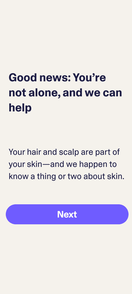
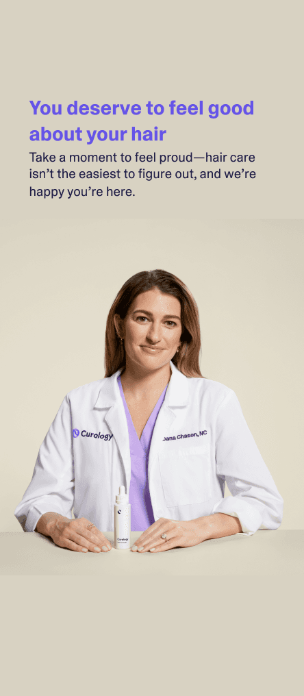
From research, we knew that the average patient had “an emotional, often negative, turbulent” relationship with their hair. Because of that, we wanted to infuse the hair quiz with empathy and reassurance wherever possible, without overdoing it.
“The tone of voice and reactions to transition screens were positive and engaging, which led to a more positive user experience”


These were some explorations we did. Not every screen made it into MVP, but they all tested well.
curology 101
How does Curology work?
Patients start by completing a skin or hair quiz to share skin concerns and goals, medical history, and photos. A licensed dermatology provider reviews their information and creates a personalized treatment plan and prescribes a Formula that targets the patient’s skin concerns. Their formula is then shipped straight to their door.
Terms
Hair Formula. A new, personalized prescription formula that tackles your hair’s specific goals.
Hair quiz. The customer-facing term for our sign-up flow.
Final MVP designs
retro
Hair Formula had a hard launch deadline, so our primary goal was to deliver an MVP capable of converting users (which we did). My time at Curology ended before we started iterations, but here are some things I’d revisit.
Re-reordering the screens
Even though Option 2 (the 50-50 question split) tested better than Option 3, I wasn’t completely satisfied with it. Having a significant number of questions post-checkout isn’t a common pattern, so users (understandably) were confused and/or would miss them.
“Users did not understand what would happen after they completed the checkout process, such as the need to answer additional intake questions and upload a photo.”
What I’d do differently
I’d like to test a version that moves most of the screens pre-checkout. The MVP was structured like this:
Hair goals
Eligibility
Health history
Hair history
Checkout
Hair goals
Eligibility
Health history
Hair history
Checkout
but I’d like to try a version that was structured more like this:
Asking nice-to-have medical questions another time
Not all questions needed to be answered in order to prescribe the patient their Hair Formula. For anything non-critical, I’d want to test asking those questions at another point in time.
What I’d do differently
I think it’d be worth testing a dashboard pop-up and/or email that leads to a form.
Pros of saving questions for later:
Shorter sign-up flow; fewer opportunities for drop-off
Potentially less negative emotion attached; less “why are you asking me this??”-type feedback
Potentially more trust built up by the time we ask; patients have had the chance to become more comfortable with Curology and are more likely to trust our expertise
Cons of saving questions for later:
No guarantee that a patient will ever answer these questions
If we require that they answer these questions before they receive their shipment, we might see a friction point wherein we’d have to refund their money after a while
bay area, ca
